

Showing posts with label Brief 3 - Commons Album. Show all posts
Showing posts with label Brief 3 - Commons Album. Show all posts
Thursday, 10 November 2011

CD holder + CD
I made 2 variations to contain my cd I wanted something simple and appropriate.
I made these up to see how they worked with other components.


I made these up to see how they worked with other components.


I made up a few cd varaiations.


Back and inside covers.
1/ APPEARANCES CAN BE DECEPTIVE
2/ PHOTO OPPORTUNITY
3/ ASCETIC FIBBER
4/ ALWAYS A GAME BETWEEN THE LIPS
5/ DONT ASK
6/ MIDNIGHT SUN
7/ LOOKING IN ALL SEEMED OK
8/ MUNITY RECRUITS
9/ LOOK LOOK AND LOOK AGAIN
Back / cover


Photographs.


Cover / photography
I made up the 2 separate album covers and photographed them, a decision will be made on how the components of the overall album interact as a range,


Development Cover
I started playing with various visuals in order to produce an effective cover, these includes sky, viewfinder, band branding etc.


Different sky


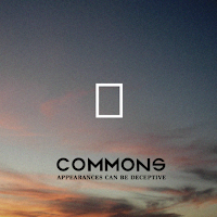


Different sky


Concentrating more on the central viewfinder.


Mock Up / Booklet
I printed out my album booklet on cheap stock to see if it worked, how people engaged with it. I realised a few problems typos, placement of image etc, I will put them right before final print.


Additional Information
This consists of right recording location etc for this i'v left a blank space on the back.


Words by Patrick Whitney, Music by The Commons
Engineered by Tom Conway
Produced by John Fairhurst
Recorded the Fuzzbox
Below is a selection of layouts on a white backdrop.


Booklet Contents Page
Below is the track information, I have decided this will be presented in upper case vinegar as it has been thoughout, for visual consistency.


1/ APPEARANCES CAN BE DECEPTIVE
2/ PHOTO OPPORTUNITY
3/ ASCETIC FIBBER
4/ ALWAYS A GAME BETWEEN THE LIPS
5/ DONT ASK
6/ MIDNIGHT SUN
7/ LOOKING IN ALL SEEMED OK
8/ MUNITY RECRUITS
9/ LOOK LOOK AND LOOK AGAIN
1/
The above strokes are also kept for the same reasons/
I don't like the simple list I would like to present my information in a more none conventional manner.
I had a little play and presented the information like this.

I like the visual that blocking the text together creates.
I might present this on the inner page in a number of ways.


New Pagination + Colour
For the booklet I have decided on a new order of pagination I would like the viewer to be introduced to the viewfinder Idea on the 1st page so in order t oentise them to open the booklet and start to interact with it. I have also left a space for a content page and further information. Whitee is my chose background.
Colour Change / Booklet
I decided that white looks a lot better as a backdrop for the photography so I made up the pages to look like this. This for me allow for focus and takes nothing away from the photography.


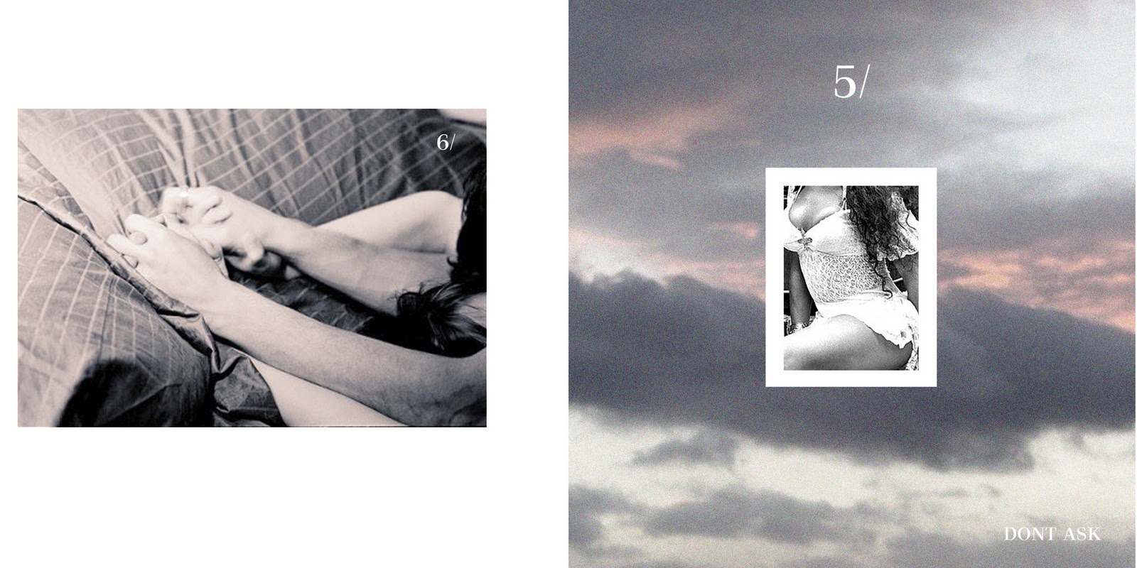

Pint out / Booklet
For the crit I printed a couple of pages for my album. Feedback was positive the concept imagey and the layout were a success, there was however some issues regarding the colours i.e. was the yellow a little jarring also that there was too many uses of different skys and backdrops.
Anyway I will resolve these issue but below is my attempt.


Anyway I will resolve these issue but below is my attempt.


Subscribe to:
Posts (Atom)